Friday, 11 April 2014

Go on, give a little

So today's post is not like my usual posts but I think it's the most important one I've done so far.  This is my cousin Mark and as you can see he has undergone quite a transformation.  He is getting ready to take part in a body show to raise awareness and money for Macmillan Cancer Support in memory of his father Stephen.


For anyone who doesn't know, Macmillan Cancer Support is an organisation which lends a great deal of help and support to people suffering with cancer and their families and friends.  Stephen was diagnosed with terminal cancer in 2013 and sadly passed away at the end of last year.  The Macmillan nurses helped the family a great deal and even made it possible for Stephen to live his last days at home surrounded by the people he loved.  Every day this organisation changes lives and helps people.  If you would like to make a contribution please click here and donate to Mark's Just Giving page.  He has put in a lot of hard work (as you can see in the picture) to raise funds to support Macmillan.  I don't think I could put my body through that.  He is an inspiration, the amount of work that goes into this kind of training is insane!

Click here and like his facebook page too.  You can read in his own words his reasons for doing this and how he has gone about it.

Once again here's the Just Giving page.  Please time a moment to donate.  You can even do it by text.  It's super easy and your money goes to a really great organisation.
Thank you

Saturday, 22 February 2014

Mateus

Lately I have been totally devouring the product photography of Mateus. 


Isn't it just completely beautiful and inspiring.
 
 
It is making me sad for my little etsy shop which I've been neglecting of late.
 
 
I love the different themes.


How can ceramics look so whimsical?
 
Lusting over these images has been a stern lesson to myself.  I must start pushing the boundaries of creativity.  Whether it is updating the images of my etsy shop, staging an inspiring photoshoot, or even taking a more whimsical and daring approaches to design.  A kick up the bum is needed.
 

Floral spring


This morning I woke up early to a beautiful spring day.  Blue skies, crisp air, dew on the ground and a few sneaking daffodils.  It's a lovely change from the last two months of solid rain.  And it got me thinking of spring trends.  Every year you can pretty much guarantee there will be plenty of floral prints and fabrics but this year I think we'll see a change in the way we bring floral themes into our homes, through bigger and brighter flower displays and garlands.
 
 
I have been admiring these floral arrangements online and the gorgeous displays on the spring catwalks.  I've found a good range of DIY tutorials for making your very own flower garland and right now I think spending a spring afternoon on the lawn sculpting a floral display would be the perfect day.
 
 
I can see these bright colours working wonderfully in a neutral decorated space, against a feature colour wall or even clashing against floral wallpaper.  The bigger and more vibrant the better. You can use fake flowers (wax or silk) to make an arrangement that lasts or real flowers to change up your style more often.


For a more cost effective and toned down approach grab a mixed bunch and try creating a simpler garland like the one pictured above.  All you'll need is flowers, string and glue to bring some of that springtime joy inside.
 
 
And don't forget the outside of your home.  I'm sure if you have a little rummage in your shed you can find some old items to spruce up with flowers.  An old bike perhaps, wellies?  There's nothing in your home that flowers can't make prettier.

Wednesday, 12 February 2014

Kitchen revamp ideas

Once again I have been asked to come up with a room revamp idea.  This time it's my brothers kitchen that needs an update.  Currently there's a lot of dark brown and tons of cupboards.  Its a bit dated to say the least with a very odd fake wooden beam going straight through the middle. . .I dunno.
Soooo first I thought of my brother and his style and lifestyle.  He's the kinda guy who likes a lot of plants hanging round.  There's always a lot of cuppas going down in his kitchen and I guess he's a little boho although he'd kill me for saying it.  So when I think of how his kitchen should be I instantly think of Scandinavian style interiors and it is so easy to update a kitchen (cheaply might I add) in this style.  It's perfect.
 
 
Now this kitchen is fabulous.  It is so simple and I love love love subway tiles.  The dark/light contrast will always look modern too.  For my brothers kitchen I'm thinking this colour scheme, dark cabinets on the bottom and white shelves on the top.


He already has cabinets on the top so all we have to do it remove the doors and paint them so he has lovely open shelving.  I'm going to make him some personalised crockery to show off in these cupboards.


I think the walls should be a pale grey like in the above image.  It will tie in nicely with the monotone colour scheme and it goes really well with the greenery in this image.  My brother needs lots and lots of plants his new kitchen.
 
 
Although if you were looking for a bit of warmth, a tan colour could also do nicely.


And with a large kitchen I think a wall of shelves is a nice feature to display books, plants, crockery etc.
 
 
But if you need a little colour in your life why not consider a dash of neon like this shelf, half hidden but so so cute.
 
Hopefully I'll able to snag some before and after shots to share!


CitizenM hotel London

Wandering around Borough last night looking for a place to eat, me and the boy did a lot of house spotting, stumbled across a fire house museum, a surprising amount of architects studios and only got slightly rained on.  Our curiosity got the better of us when we passed several giant windows with a totally tempting lobby lurking behind.  So that is where we had dinner, CitizenM hotel.
 
 
The huge open plan lobby has a help yourself food station with pastries galore, and a swanky London hotel wouldn't be complete without a selection of pretentious bottled water.


The lobby seemed endless and had a typical red and blue colour scheme going on.  It was split into several seating areas.  One which was thoughtfully lit for work away from home.  Another had the above floating light feature.  My favourite was the snuggly fire side relaxation space, pictured below. 


Check out that pretty tripod floor lamp.
 
 
The stairs were the biggest feature.  I couldn't take my eyes off them.  I just love a feature staircase.
 
 
Everywhere we looked there were books books books, which is my kinda place.  I'm sure I spotted the entire classic penguin collection.  Most of which was on bookshelves too high for practical use but they made wonderful decorative features. 
 
CitizenM Hotel was designed by Concrete Architectural Associates.  Although I wouldn't quite recommend the lobby food I would recommend a casual drink and the opportunity to bask in this interestingly modern designed space.


Thursday, 6 February 2014

Pin of the day: Copper dusk

February is here Spring is nigh!  And for me the colour palette in this photograph sums up this time of year perfectly.  Not quite the bright shades of summer but a subtle harmonising combination of dusky pink, grey, beige and copper.  This pin whispers romance.
 

Tuesday, 13 August 2013

Etsy finds: armchairs

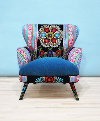
So this week I've been feeling the heat as in 'oh god when will summer be over so I can just wear black and not feel like I'm melting into a big puddle of grossness' that pretty much sums it up actually.  But one thing I will miss about summer when it is finally over is all the fabulous bright prints and fun colours that hang around.  I love autumn and the lovely colour palette that goes with it but summer colours are so much fun.  Luckily it is not yet widely acceptable to redecorate your home to fit with the seasons (other than the obvious holiday decorations duh) so we can have summer brightness in our homes all year round.  And if you're looking for such a thing I have the answer!  It comes in the name of Namedesignstudio and in the form of fabulous furniture.  Get a load of these guys. . .


The actual studio is in Istanbul, Turkey and the items are handmade by Jo Supara and Ali Tarakci.  These chairs are just stunning aren't they.  My favourite is the one at the top, the Patchwork armchair with Suzani and dark purple velvet fabrics.  Its so mysterious and moody.  What's your favourite?